Monday 31 October 2011
Tuesday 18 October 2011
Analysis of Double Page Spread Articles
- There is an image on one page in a medium close up or medium long shot (usually the left page) -signifies aspects of the artist/band article
- Date and page number at the bottom, usually has the masthead too
- They always have bylines
- They always have a drop capital to start the article
- The title is usually short and snappy
- Standfirst -bold paragraph underneath the title, but above the article
- They usually have drop quotes in big lettes from the story, to make it stand out (exciting or controversial)
- 11pt font
- Imformal mode or address to ocnnect with audience
- Use 3/4 colums
- Consisent colour scheme relates to image
- Artist's name is always in bold
Analysis of Professional Magazine Contents Pages

- The colours match the logo
- They always have a variety of pictures
- There is always numbers on the pictures
- They usually have graphics areound some words to make them stand out
- Use 2/3 columns
- There will always be a date (usually at the bottom right corner, or the top left corner)
- There will always be contact details (usually at the bottom of the page)
- There are more photographs than writing
- Use 2/3 colours (same colours as the front cover)
- Says 'Contents' at the top of the page
- Usually have banners to highlight something
- Usually have an advert for the next issue

Analysis of Professional Magazine Covers

- Images are usually in a medium long shot or medium close up
- Images are usually in direct address
- They usually have images of famous people
- Images are mainly in studio shots or live performances
- The images are mostly mean and moody
- The masthead is always at the top
- The masthead is always clear
- They use simple words for the masthead
- The masthead relates to the genre
- The masthead is bold and stands out
- The font is different to the masthead (there are usually about 2 different fonts)
- They always have a colour scheme and stick to it (usually baout 3 colours)
- The colours usually relate to the genre or target audience
- There is always a main central image in the background
- There are coverlines around the main image sometimes at the bottom as well
- They will always have a barcode at the bottom, either in the right corner, or the left corner
- Use of graphics
- Graphics higlight key points on the cover

Monday 17 October 2011
Initial Plans For My Magazine
Price: £3.50
Frequency of publication: Weekly
Issue Size: 85 pages
Regular Content: Posters, Pictures, Reviews, Interviews
Feature Atcicles: "Top 50 songs you ought to know!" "Inside information on the LOUD! festival" "Interviews with one of the bands that performed in the LOUD! festival"
Frequency of publication: Weekly
Issue Size: 85 pages
Regular Content: Posters, Pictures, Reviews, Interviews
Feature Atcicles: "Top 50 songs you ought to know!" "Inside information on the LOUD! festival" "Interviews with one of the bands that performed in the LOUD! festival"
Saturday 15 October 2011
Initial Ideas
I've decided to do an Indie magazine, because they have different codes and conventions to most other magazines, so it makes it more interesting. My audience will be targeted at 15-17 year olds who like indie music.
Friday 14 October 2011
Thursday 13 October 2011
Friday 7 October 2011
Wednesday 5 October 2011
Final photos for the School Magazine
This will be the image on my front cover
My editor's picture
The picture for the sports section
The picture for the trip to Italy
The new 6th Form ID badges
My main picture, also will be used for the "Necessities for 6th Form!"
Monday 3 October 2011
Photographs for School Magazine
This will be my editor's photo
This will be my main picture. this is a good picture, because she has a uniform on and she looks tidy and smart.
This will be my main image for my contents page.
This will be one of the images in the contents page.
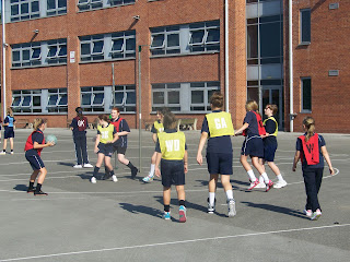
This was going to be my sports image, but I took another photo instead.
This was going to be my main image on the front cover, but I thought it would be better to have a picture of a student in uniform.
This was going to be my main image on the front cover, but I thought it would be better to have a picture of a student in uniform.
I was going to use this image for the magazine, however I don't think it shows that it's a school.
This was going to be my main image on the front cover, but I thought it would be better to have a picture of a student in uniform.
This was going to be my sports image, but I took another photo instead.
This is the photo I'm using for the school magazine in the sports section of the contents page.
This was going to be my sports image, but I took another photo instead.
This picture will also go on the contents page.
Sunday 2 October 2011
Layout for Contents page
this will be my contents page, however, I'm not going to use the pictures from the left section and the picture above the main image. I'm also going to have an editor's message and I'm going to move the top section, 'This Article Includes...', into the middle section.
Planning for Contents page
My editor's picture
The picture for the sports section
The picture for the trip to Italy
The new 6th Form ID badges
My main picture, also will be used for the "Necessities for 6th Form!"
Subscribe to:
Posts (Atom)


