Tuesday, 31 January 2012
Friday, 27 January 2012
Thursday, 26 January 2012
Wednesday, 25 January 2012
Tuesday, 24 January 2012
Monday, 23 January 2012
Sunday, 22 January 2012
Friday, 20 January 2012

Sunday, 8 January 2012
Annotated Screenshots of Double Page Spread
I put the masthead in the bottom corner of my double page spread to follow the codes and conventions of other indie magazines. I also made sure the page number was the same as it is supposed to be on the contents page.


I moved up all the text, so that the page number woulf fit better on the page. I did this by clicking on the text boxes and moving them up.


Saturday, 7 January 2012
Annotated Screenshots of Contents Page

I laid my contents out into the centre alignment, but I didn’t like it so I changed it. So they were on the left side alignment. I did this by clicking on the picture/text that I wanted to move and dragged them into a different place on the page.

This is what the layout looked like when I moved them to the left.


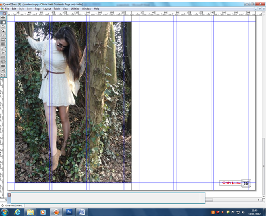
I thought it might look better with the contents in the middle section of the contents page, so I moved it. I thought this, because all the pictures were too close together. I did this the same way I moved the content in the first screenshot.

 This is my new ‘Subscribe’ box, I done this so that it stand out more, I also changed the font colour to yellow as it is a different colour to the rest of the contents page, so it would get someone’s attention. I did this by clicking on the box with the A, at the left side of the screen and dragged it to make a box. I filled the box with the text I wanted and changed the colour to yellow, by highlighting the text and selected a colour on the right side. I also used the box with the cross inside, as it allowed me to upload the picture of my front cover.


I changed the information in the “One Dream, One Band, One Direction” box and the “Richard Thursal” box, so that they were clearer that they’re indie singers. I also changed some of the articles, as they weren’t clear. I did this by highlighting the text that I wanted to change, deleting the text and wiritng something more self-explainatory. I would have explained the articles, but none of the magazines I done research on, explained any of the article titles they used, on the contents page.
 I changed the picture from One Direction, to a picture of Boyce Avenue, as feedback said that One Direction are not an indie band and didn't fit with the genre of the magazine. I also added a picture below it, of an album. I also changed the title and the font of the masthead, to match the front cover. I did this by deleting the text box completely, and wrote a new text in a new text box and changed the font to 'Ebrima'. This is my final contents page.
Friday, 6 January 2012
Annotated Screenshots for my Front Cover
 I changed my main colours, because it didn’t go with the indie codes and conventions, so I changed them to red, white and black.
I put a box over the ‘Exclusive', because it made it stand out more. I did this by making a new layer, clicking the dashed square on the left side, then filled the box in red, by clicking on the black box, at the bottom of the left side if the screen.

I changed the colour of the REBECCA, because it was a different colour to the ROBERTS and it didn’t look very good. I did this by selevting the ext on the right side, then clicking a colour from the bloack box, at the bottom of the screen. I also made the writing on the side smaller, so the writing wouldn’t cover her face. I did this by selecting the text on the right, then clicking Ctrl+T, as it lets you re-size layers on Photoshop.
 I changed the article from “Tinie Tempah” to “Boyce Avenue”, because my audience feedback showed that Tinie Tempah wasn’t an indie singer. I did this, by selecting the text, then clicking T, as it lets you change the text to what you want.


I changed the title of the '25 greatest indie bands of all time', because it wasn’t specific enough, so I changed it to an article about a specific person. I did this by selectingthe text, clicking T and changed the text.


 I changed the 'WIN!' box, into a banner at the bottom, so that is shows more of the guitar, which is a major instrument in indie bands. To do this, I deleted the previous box and made a new box, then I moved all the text from the previous box into this box. I had to make all the text smaller, otherwise it wouldn't fit in the box. I also made the Exclusive box straight, as my audience feedback said that no indie magazines have slanted boxes. This is my final front cover.

Thursday, 5 January 2012
Audience Feedback


This is good, because the majority of the people who answered my questionnaire were in my target audience, by gender and age, therefore they will be able to give valid opinions.

This is good, because Q was the magazine I got ideas from and 50% of the people who done the questionnaire read the magazine.

Only 1 person said that my magazine didn't look like a real magazine. this is good, because although 1 person said it didn't look like a real magazine, 9 people said it did look like a magazine.

The most popular answer, was that they would buy my magazine. This is good, because if people would want to buy it, it means it must look like a proper indie magazine.

Everyone said that if they seen my magazine someone (e.g. in the waiting room of a hospital) they would read it. So even though not everyone would buy it, they would still read it which would be good for advertisement.

the most popular answer was tht it was aimed at 15-18 year old, which is good, because that's my target audience. No one said it would be good for 10-13 year olds, as it has musical content in their, that they wouldn't know about (e.g. Mick Jagger).

The majority of people said they liked the picture on the front cover, as the lighting on him looks really effective. However, 2 people said no, because they thouoght the mise-en-scene didn't look indie enough.

Only 1 person said that I didn't use the right images in my contents page, which is a good thing. However the reason they said this, was because they were mostly not very known bands. The other 9 people liked the fact that the bands weren't very well-known, as other magazines show non well-known bands.

7 people said that I used the right image for my double page spread, as it showed that she wasn't an agressive indie singer, like most boybands, but she was more soft, like Florence and the Machines. The 3 people who didn't like it, said it would've been better as a performance, or made her look more angry.

Everyone who done the questionnaire said they thought I followed the codes and conventions of other indie magazines. I knew this, because I shown them a copy of Q magazine and they said it had a slightly similar layout and language to Q.

90% of people who answered, thought the magazine had an indie magazine layout. 1 person said it didn't have the same layout, because it had blue on the front cover and he had never seen an indie magazine with blue text on the front cover.

Only 50% of people said that I have the right language for an indie magazine, because my language was more formal than most magazines. They said the Double Page Spread had the correct language, but the contents page didn't, because indie magazines don't go into too much detail on some of the articles, whereas I did.
Subscribe to:
Posts (Atom)