I put the masthead in the bottom corner of my double page spread to follow the codes and conventions of other indie magazines. I also made sure the page number was the same as it is supposed to be on the contents page.
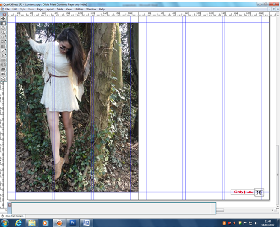
This is what the article looked like when I imported the text onto Quark. I imported it by, making a text box, then right-clicking, I then clicked 'import text' and selected what text I wanted to import.
I moved up all the text, so that the page number woulf fit better on the page. I did this by clicking on the text boxes and moving them up.
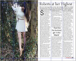
I used the drop capital 'S'. To do this, I went to the Measurements window, clicked on the correct section (the one higlighted), then ticked 'Drop Caps', then I put the number of lines to 5, and put that number of letters to 1, as I only wanted the 1 letter to be a drop capital. For my drop quote, I made a text box and put my favourite quote into the text box. I put it on the pge with the picture, as I thought it would stand out more.
I changed the name of my article, as my audience said they didn't like the title 'Roberts at her Highest'. To do this, I deleted the previous text box, and made and wrote my new title in it. I also made it bigger, to stand out more. to make it bigger, I had to select the text I wanted to make bigger, then use the corner little squares on the text box and the hand will make it as big as I want it to be. I also moved the main quote onto the left page, as feedback said it made the quote stand out more.
I moved the text on the left hand side, onto the next page, as it looked very random in the middle of the page. I also moved around the layout of the right side, to make it fit better onto the page. This is my final double page spread.


No comments:
Post a Comment