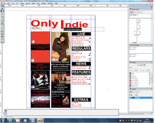
I laid my contents out into the centre alignment, but I didn’t like it so I changed it. So they were on the left side alignment. I did this by clicking on the picture/text that I wanted to move and dragged them into a different place on the page.
This is what the layout looked like when I moved them to the left.
I thought it might look better with the contents in the middle section of the contents page, so I moved it. I thought this, because all the pictures were too close together. I did this the same way I moved the content in the first screenshot.
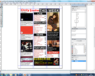
Before changes to ‘Subscribe’. I also made the logo smaller and added a 'THIS WEEK' box. To do this, I had to drag the Only Indie box, to make it smaller and I then added a new text, by clicking on the box with the A and I also used the box with the cross and filled it in black, to make a background for the text.
 This is my new ‘Subscribe’ box, I done this so that it stand out more, I also changed the font colour to yellow as it is a different colour to the rest of the contents page, so it would get someone’s attention. I did this by clicking on the box with the A, at the left side of the screen and dragged it to make a box. I filled the box with the text I wanted and changed the colour to yellow, by highlighting the text and selected a colour on the right side. I also used the box with the cross inside, as it allowed me to upload the picture of my front cover.
I changed the colour of the boxes on the right column, because I didn’t like the look of the ‘Extras’ box being different to all the other boxes. I did this the same way as I had done the Extras box, I clicked on the box and selected the colour I wanted to change it to. you have to make sure that on the right side of the screen, the tool, that looks like a hand, called the content tool, is selected. I also had to fix change the layout slightly, so that the texts would all be level at the top.
I moved some of the texting around so that they were centred into the boxes, behind them. I also took away my picture of the Florence and The Machines album, because I didn’t take the picture myself. I done this by clicking on the picture and pressing delete. It kept the box there, so I had to delete that as well. To delete something you have to make sure that the tool used, is the one that looks like a 4-way arrow, called the item tool, on the left side of the screen.
I changed the information in the “One Dream, One Band, One Direction” box and the “Richard Thursal” box, so that they were clearer that they’re indie singers. I also changed some of the articles, as they weren’t clear. I did this by highlighting the text that I wanted to change, deleting the text and wiritng something more self-explainatory. I would have explained the articles, but none of the magazines I done research on, explained any of the article titles they used, on the contents page.
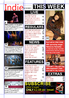
 I changed the picture from One Direction, to a picture of Boyce Avenue, as feedback said that One Direction are not an indie band and didn't fit with the genre of the magazine. I also added a picture below it, of an album. I also changed the title and the font of the masthead, to match the front cover. I did this by deleting the text box completely, and wrote a new text in a new text box and changed the font to 'Ebrima'. This is my final contents page.


No comments:
Post a Comment