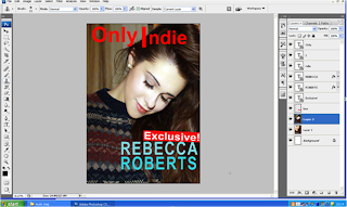
 I changed my main colours, because it didn’t go with the indie codes and conventions, so I changed them to red, white and black.
I put a box over the ‘Exclusive', because it made it stand out more. I did this by making a new layer, clicking the dashed square on the left side, then filled the box in red, by clicking on the black box, at the bottom of the left side if the screen.
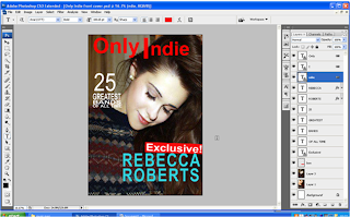 I changed the colour of the REBECCA, because it was a different colour to the ROBERTS and it didn’t look very good. I did this by selevting the ext on the right side, then clicking a colour from the bloack box, at the bottom of the screen. I also made the writing on the side smaller, so the writing wouldn’t cover her face. I did this by selecting the text on the right, then clicking Ctrl+T, as it lets you re-size layers on Photoshop.
 I changed the article from “Tinie Tempah” to “Boyce Avenue”, because my audience feedback showed that Tinie Tempah wasn’t an indie singer. I did this, by selecting the text, then clicking T, as it lets you change the text to what you want.
I changed the colour on the side, because there was too red on the front cover, however, now there is too much blue, so on the side writing, I changed it to black and white writing.
I put a red banner at the bottom, so the ‘WIN’ statement would stand out and would attract people to buy it. I did this the same way I did my Exclusive box, but tilted the box, so that the angle would fit in the corner.
I changed the colours on the side, as there was too much blue on the front cover. I also changed the picture, because it didn’t show that it was an indie magazine, whereas this shows it is an indie magazine.
I changed the colour of the writing on the left, so it stood out more, as you couldn’t see the black writing. Also, I made the left column narrower, as the headlines were too wide. I did this by selecting the text, from the right side of the screen, then clicking Ctrl+T and re-sized them until all the texts were in line with each other. I moved the isbn to the bottom of the page, so I could make my masthead larger so it would stand out more. I did this by licking Ctrl+T also, as it can move things around as well as re-size them.
I changed the article from “Tinie Tempah” to “Boyce Avenue”, because my audience feedback showed that Tinie Tempah wasn’t an indie singer. I did this, by selecting the text, then clicking T, as it lets you change the text to what you want.
I changed the colour on the side, because there was too red on the front cover, however, now there is too much blue, so on the side writing, I changed it to black and white writing.
I put a red banner at the bottom, so the ‘WIN’ statement would stand out and would attract people to buy it. I did this the same way I did my Exclusive box, but tilted the box, so that the angle would fit in the corner.
I changed the colours on the side, as there was too much blue on the front cover. I also changed the picture, because it didn’t show that it was an indie magazine, whereas this shows it is an indie magazine.
I changed the colour of the writing on the left, so it stood out more, as you couldn’t see the black writing. Also, I made the left column narrower, as the headlines were too wide. I did this by selecting the text, from the right side of the screen, then clicking Ctrl+T and re-sized them until all the texts were in line with each other. I moved the isbn to the bottom of the page, so I could make my masthead larger so it would stand out more. I did this by licking Ctrl+T also, as it can move things around as well as re-size them.
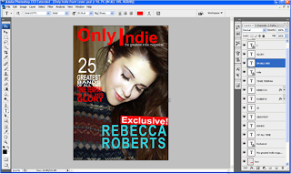
I changed the title of the '25 greatest indie bands of all time', because it wasn’t specific enough, so I changed it to an article about a specific person. I did this by selectingthe text, clicking T and changed the text.
I had to add ‘FESTIVAL’ to the front cover, as my audience feedback said that ‘Backstage at Leeds’ wasn’t clear enough, so I had to lift all the rest of the work up, otherwise the ‘festival’ would’ve overlapped on the WIN banner. I did this by selecting the separate texts, clicking Ctrl+T and moving all the texts up.
I had to change the main article title, as the main picture was not of Rebecca Roberts anymore.
I changed my masthead font, because it wasn’t unique compared to the rest of the front cover. I also changed the name and took the ‘Only’ off, as ‘Indie’ is catchier. However, I did like the name ‘Only Indie’ so I put it as the positioning statement.
I made the ‘Exclusive’ box smaller, as it was too big. I also moved the background picture up, so that you could see his guitar more.
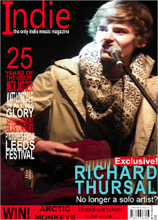
I changed the 'WIN!' box, into a banner at the bottom, so that is shows more of the guitar, which is a major instrument in indie bands. To do this, I deleted the previous box and made a new box, then I moved all the text from the previous box into this box. I had to make all the text smaller, otherwise it wouldn't fit in the box.
I also made the Exclusive box straight, as my audience feedback said that no indie magazines have slanted boxes. This is my final front cover.
 I changed my main colours, because it didn’t go with the indie codes and conventions, so I changed them to red, white and black.

 I changed the article from “Tinie Tempah” to “Boyce Avenue”, because my audience feedback showed that Tinie Tempah wasn’t an indie singer. I did this, by selecting the text, then clicking T, as it lets you change the text to what you want.


 I changed the 'WIN!' box, into a banner at the bottom, so that is shows more of the guitar, which is a major instrument in indie bands. To do this, I deleted the previous box and made a new box, then I moved all the text from the previous box into this box. I had to make all the text smaller, otherwise it wouldn't fit in the box. I also made the Exclusive box straight, as my audience feedback said that no indie magazines have slanted boxes. This is my final front cover.
No comments:
Post a Comment